Nirvana Being
Updating the e-commerce Website of “Nirvana Being”


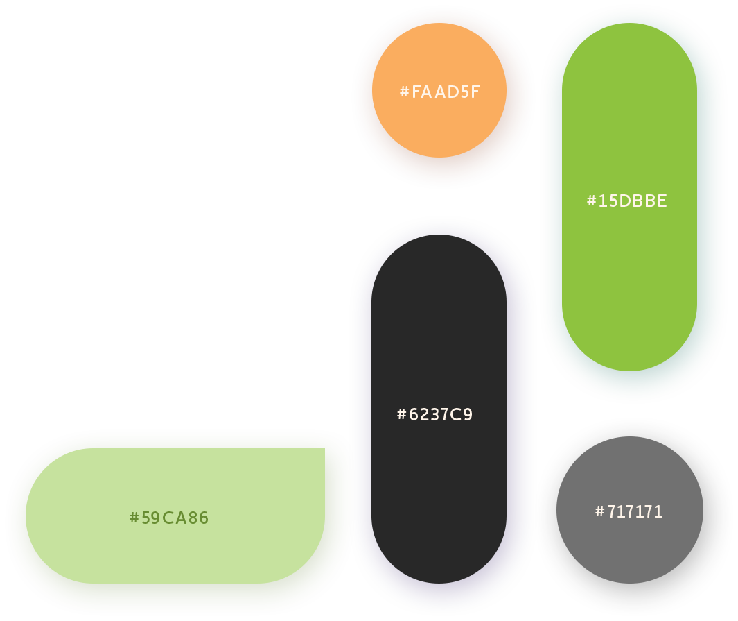
COLORS
Nirvana Being is a brand of trust and health. The color palette selected exemplifies the essence of the brand well.

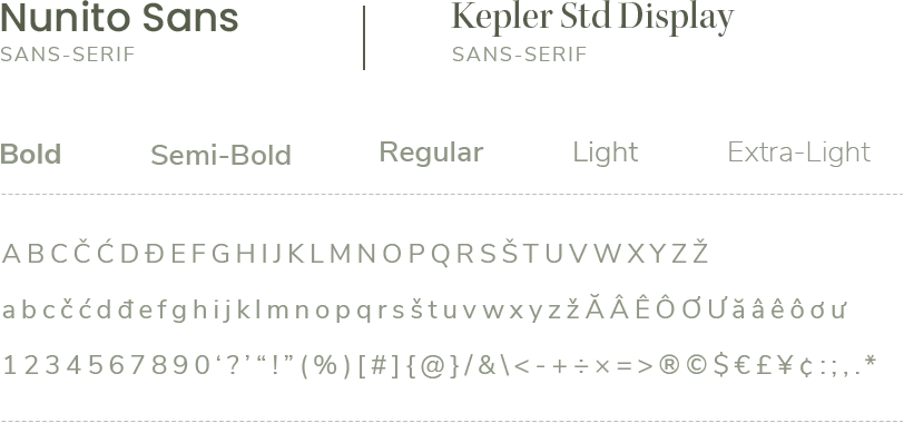
TYPOGRAPHY
The fonts have been selected such that they resonate well with the overall visual aesthetic of the website.

ICON
A specific design theme was selected to design the icons on the website.
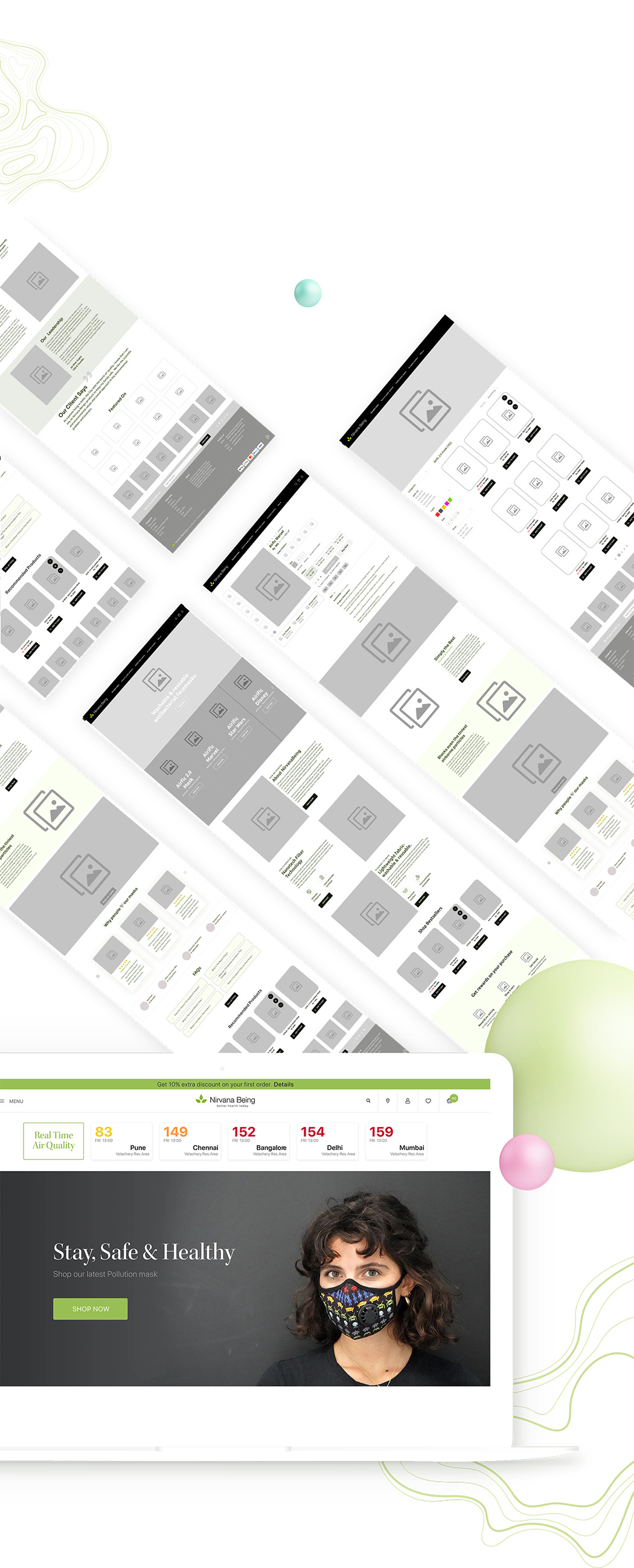
WIREFRAMES
Wireframing of the website helped in understanding and integrating the user flows and the information architecture.
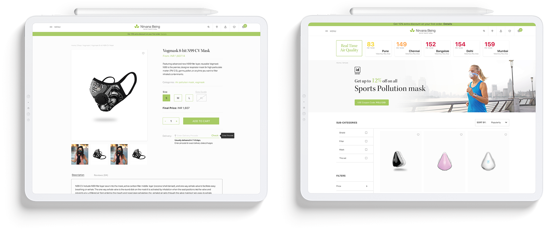
High Fidelity Design
The pixel-perfect website design elements and pictures were finalized to showcase the final look of the website.
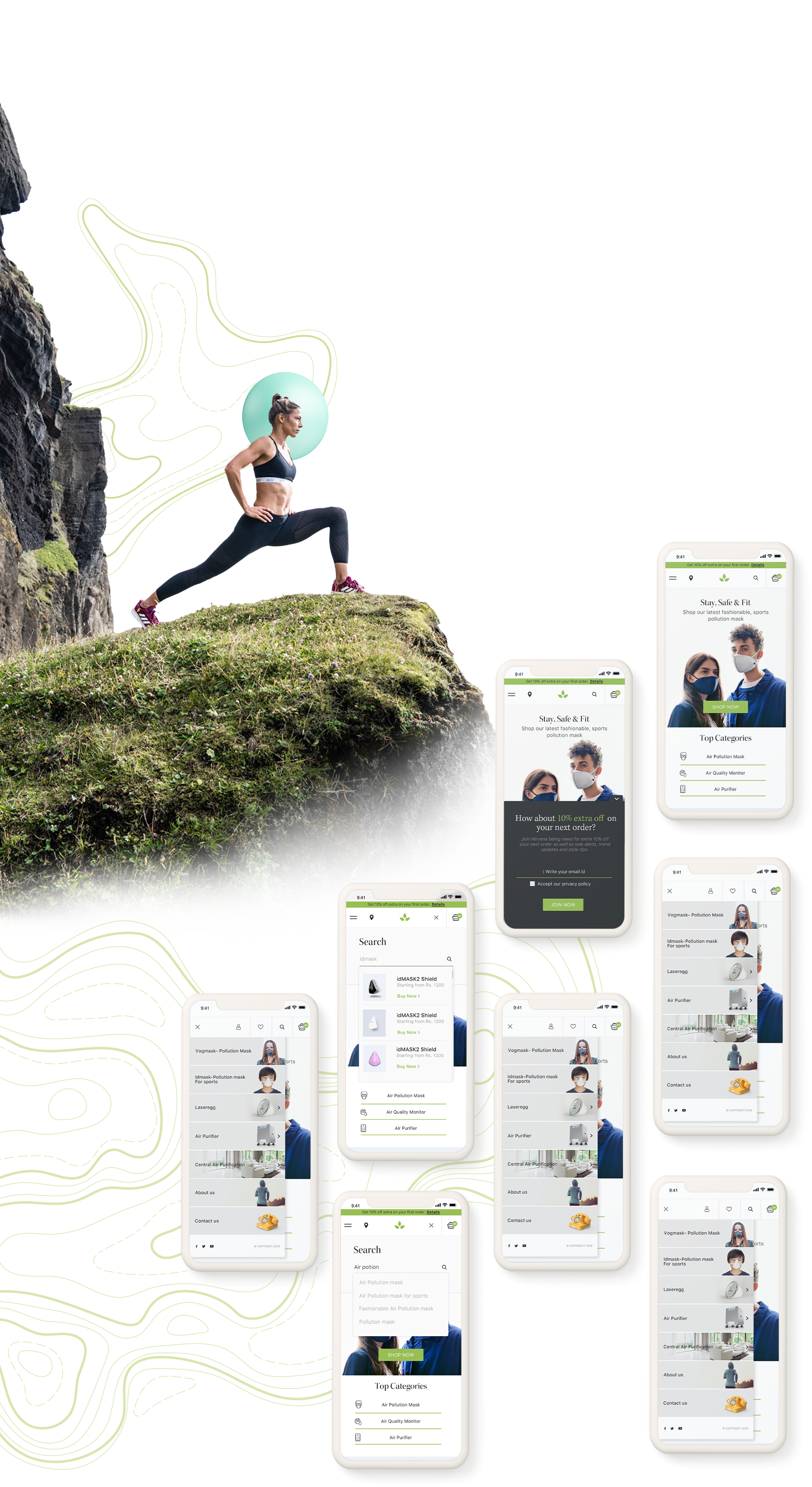
Responsive Design
The website was designed such that the overall feel and design of the website remains the same irrespective of the device used.
Everything above the fold
The homepage was designed in order to show a slideshow and also giving the users options to get straight into the product pages. Clear Click-to-action buttons were placed strategically.
- Clear CTA above the fold
- Have descriptive CTAs
- Clear benefit-oriented value
- prop above the fold
- Display top categories on homepage
- Use legible font sizes
- Use social proof
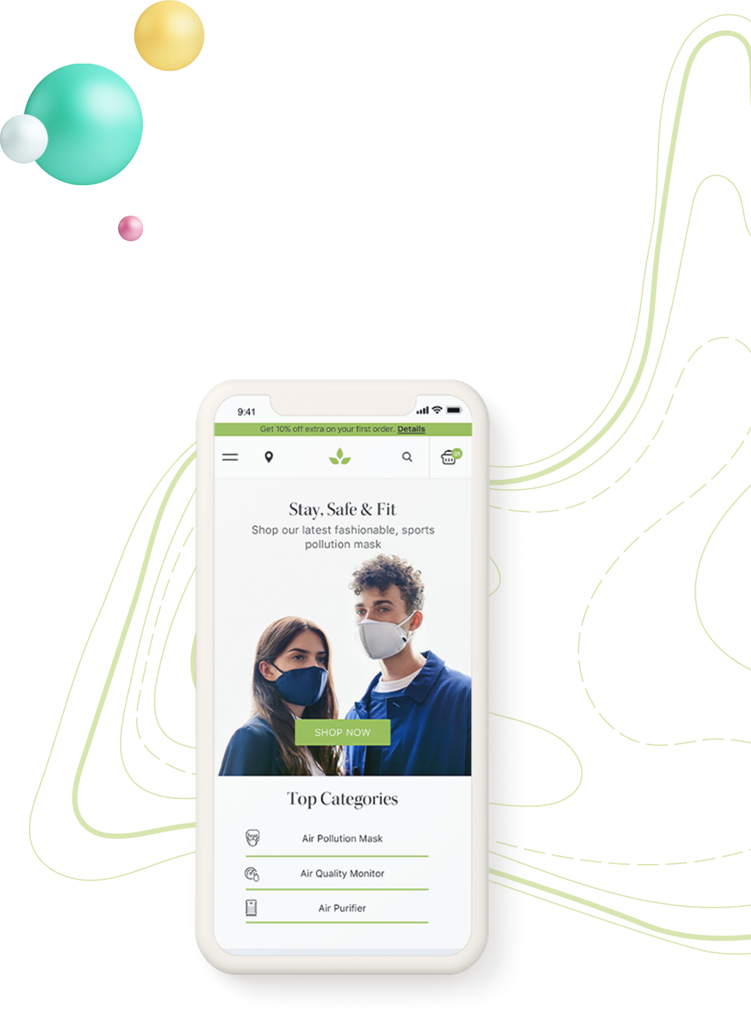
Home Page

Visit Site
Related Project Vestige best deals
Newsletter Subscription
To stay updated on important happenings in the world of design, join my mailing list.
